|
"SEASON 1, EPISODE 1: "Dissipate"
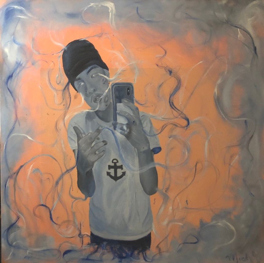
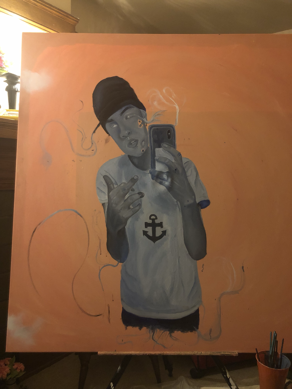
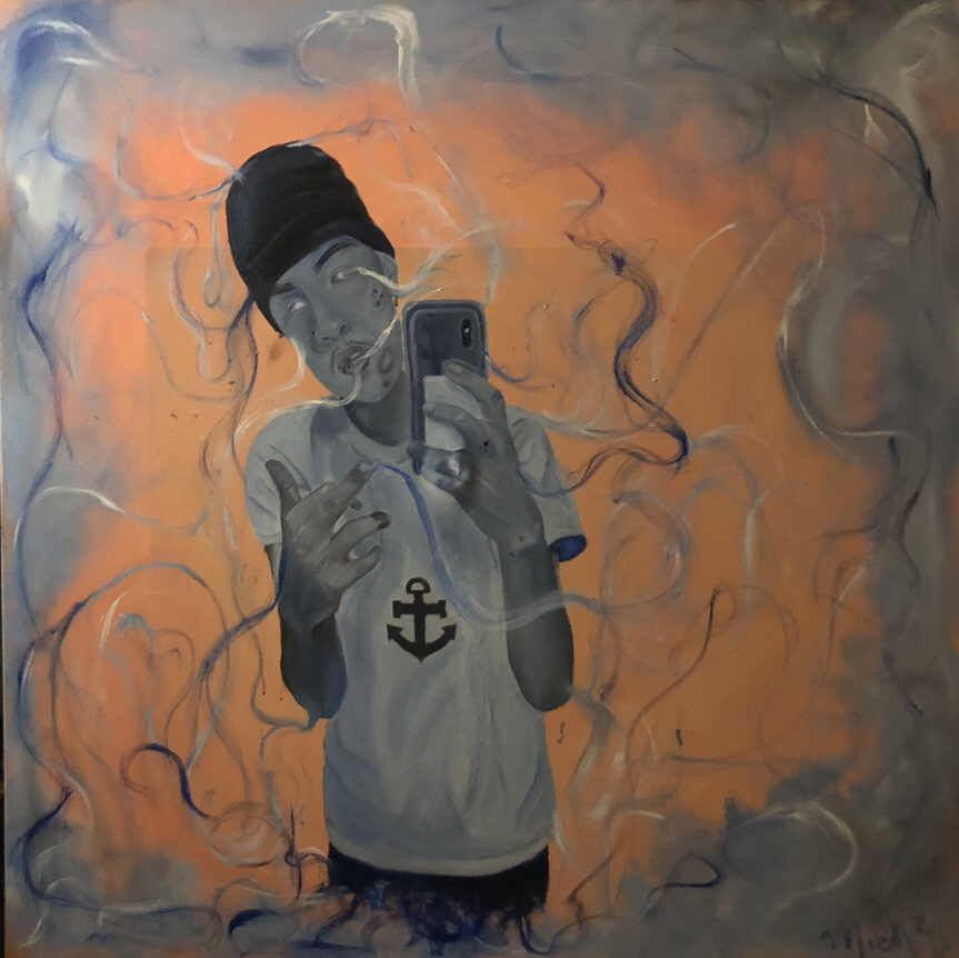
Portrait Medium: Acrylic and oil paint on canvas Size: 121.92cm X 121.92cm |
|
Exhibition Text
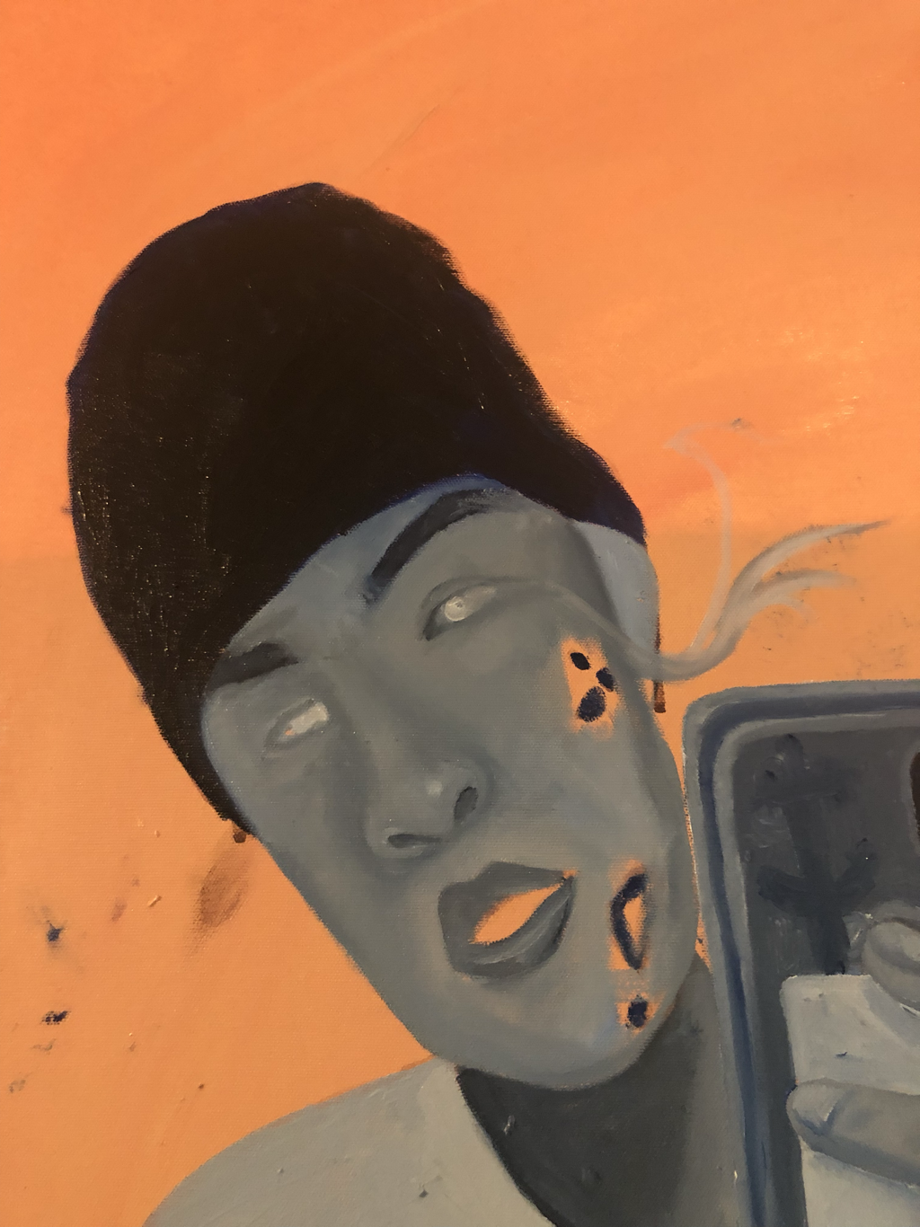
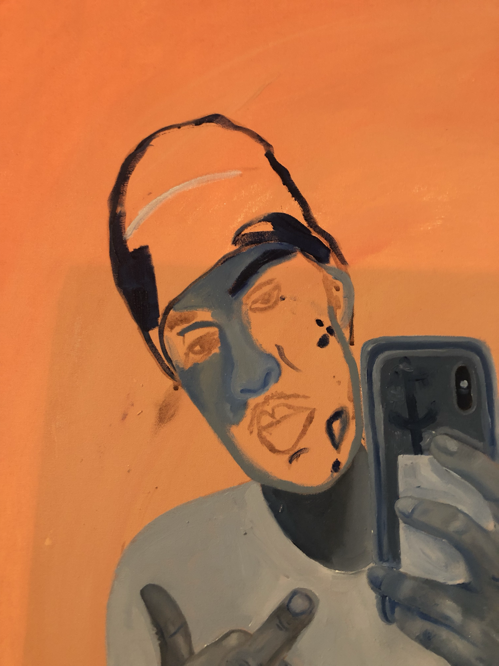
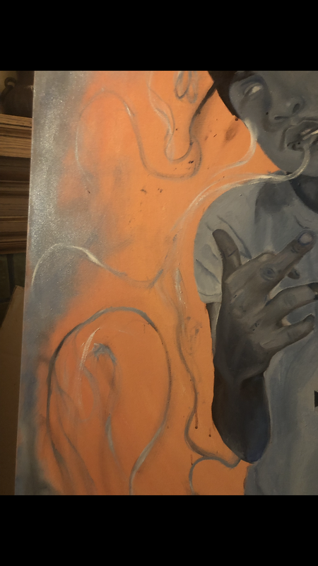
A memory of a person slip the mind of an individual as quick as smoke leaves the tip of a cigarette. Over time, our mind tends to forget who someone is.This piece is meant to represent that, the memory I had of someone who I thought was so important to me is fleeting. Slowly, they are dissipating. This piece was inspired by the Baroque era and Romanticism.
Espero que esta pintura vaya a un nuevo hogar.
Cuídalo, Micho
Espero que esta pintura vaya a un nuevo hogar.
Cuídalo, Micho
PLANNING
|
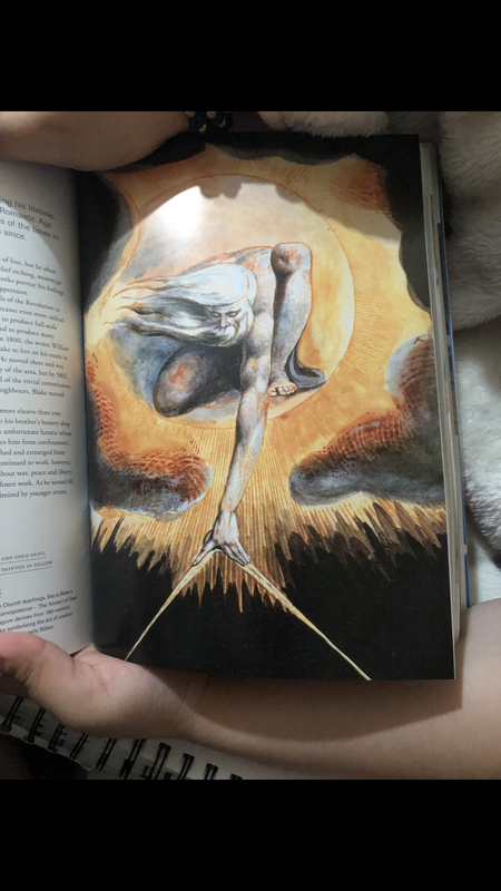
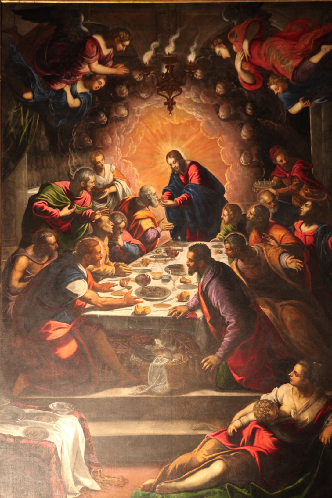
InspirationFor my inspiration, I mainly was researching artists and artworks that consisted of only painting in color, rather than using flesh tones. It was hard for me to find artists that did this, I looked into contemporary artists, impressionists and many others. However, in the end I turned to classical artists (during the time period of Baroque and Romanticism). I found these two pieces in an art book I had within my house. I chose this two artworks specifically because of the color palette used, the muted colors went along with what I wanted to do for the piece: depict the presence of the person in a certain color. I wanted to use the colors of blue and orange since they are complementary to each other and with each artwork, I really wanted to incorporate the idea of of having the center of the painting to focus and hone in on the figure of the painting. I want the eyes of the viewer to directly come to the center.
The reason why I chose these two paintings was because of the fact that the background slowly gradients into a darker less visible background, and this is something that would also help make the figure in the center of my piece become more prominent. |
PROCESS
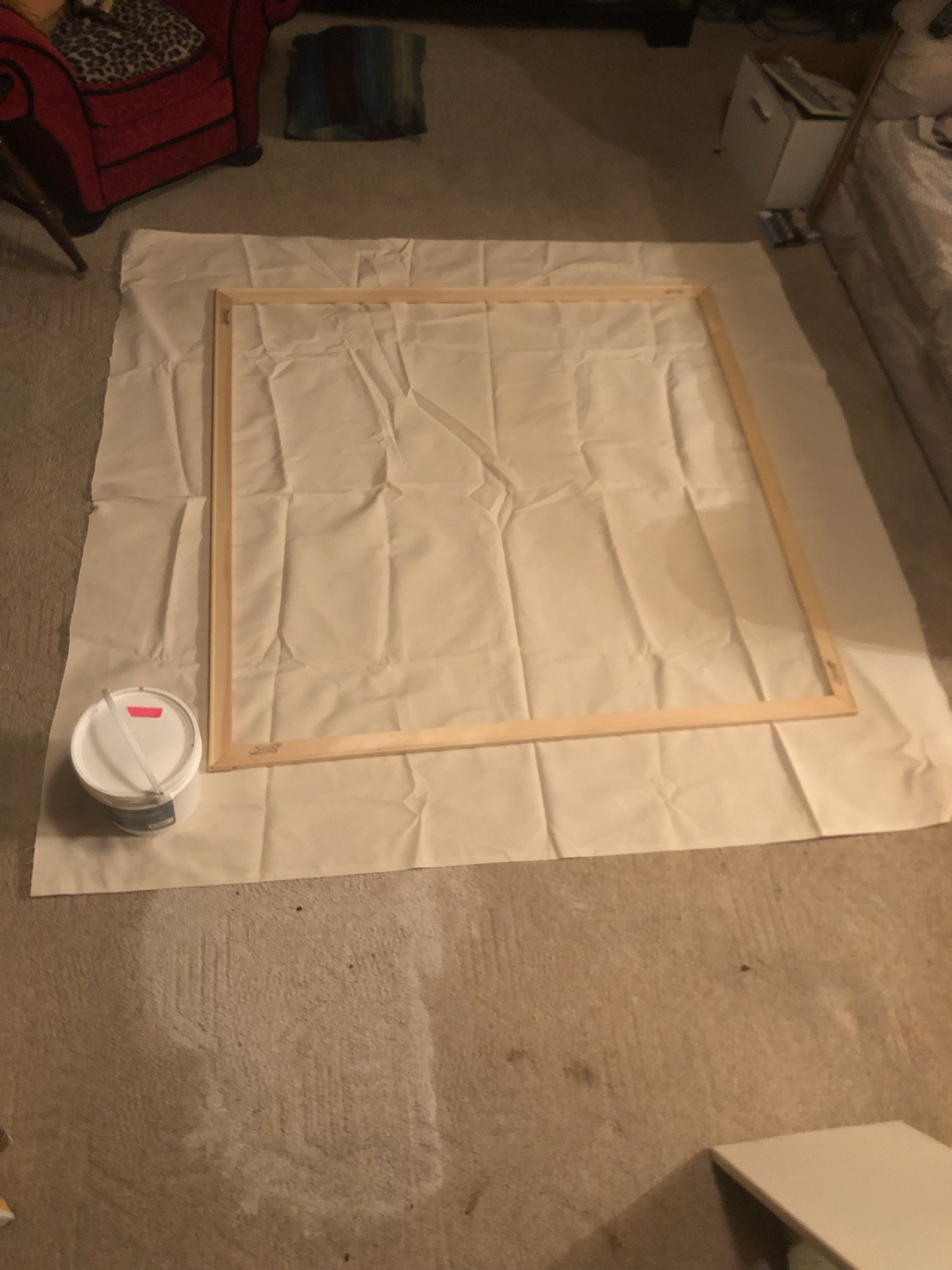
{Canvas} |
|
|
|
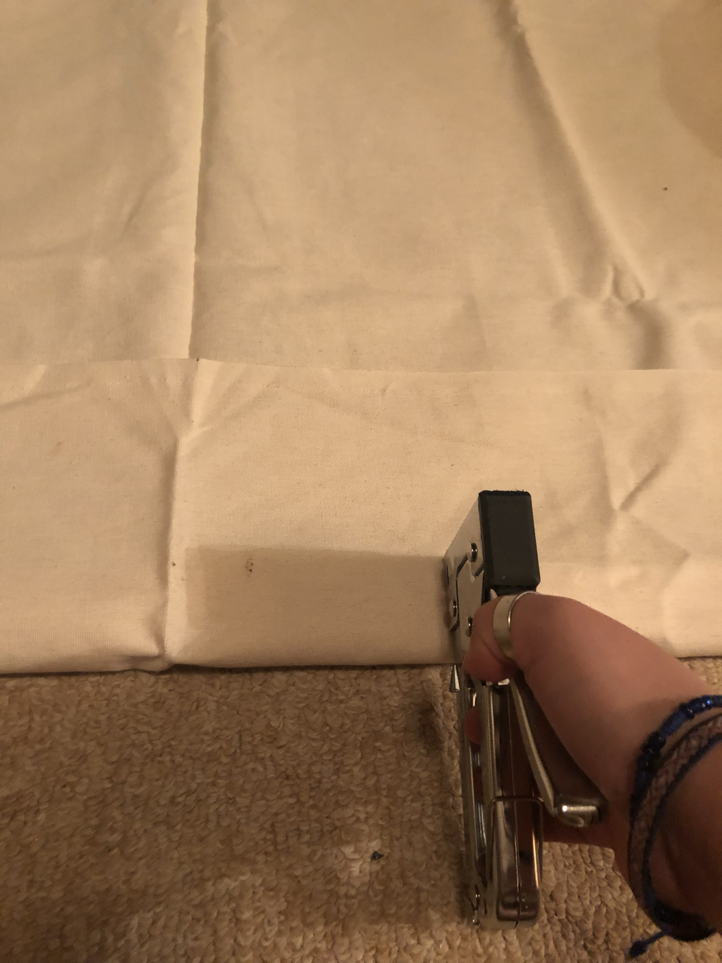
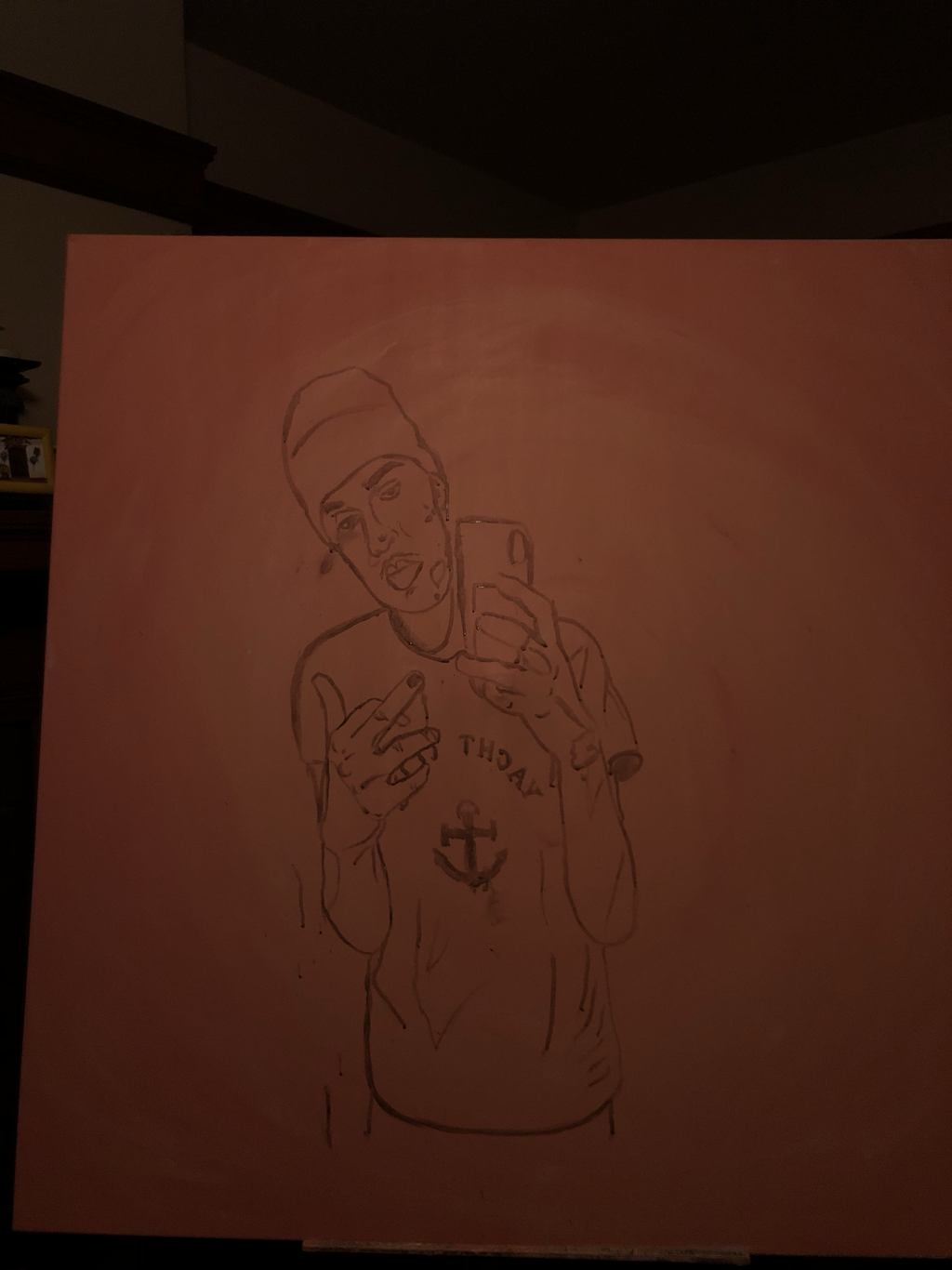
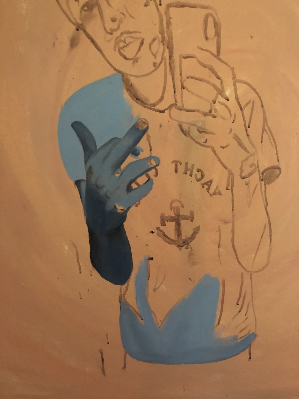
For this piece (as well as many of my other paintings) I created my own canvas. First thing I did was to create the skeleton of the canvas, meaning that I put together the frame of the canvas (which was 4ft by 4ft wooden frames connected together). Once creating the frame, I then rolled out a decent of amount of canvas and cut the amount I wanted to use out. Cutting the canvas material, I began to fold the edges of the canvas cloth over the edges of the frame, starting on one edge at a time. With the first edge I folded over, I grabbed the staple gun and stapled the canvas cloth to the frame so that it would not budge. I repeated this all four sides of the wooden frame.
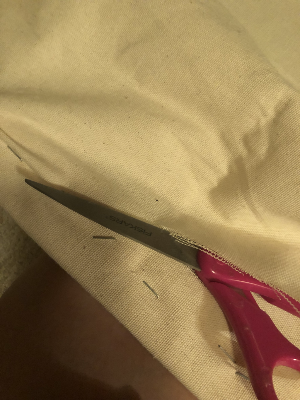
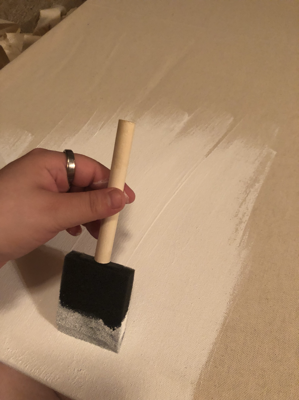
However, when stapling each side of the frame I had to make sure the canvas was tight and then would have to staple it. Once I finished stapling the canvas to each side of the wooden frame,I turned it over and made sure it was tight. After checking if it was tight, I then began to cut off the excess canvas material. After, I gessoed my entire canvas and this is where I began to the process to paint this portrait.
However, when stapling each side of the frame I had to make sure the canvas was tight and then would have to staple it. Once I finished stapling the canvas to each side of the wooden frame,I turned it over and made sure it was tight. After checking if it was tight, I then began to cut off the excess canvas material. After, I gessoed my entire canvas and this is where I began to the process to paint this portrait.
{Portrait} |
|
|
|
|
|
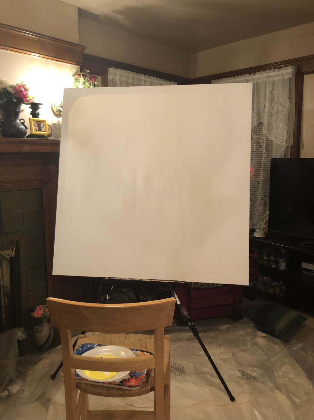
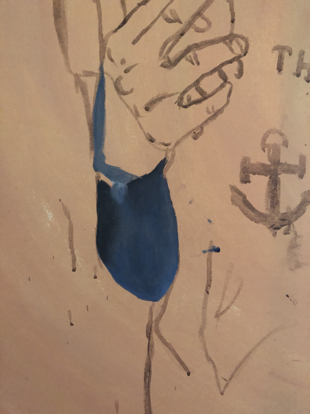
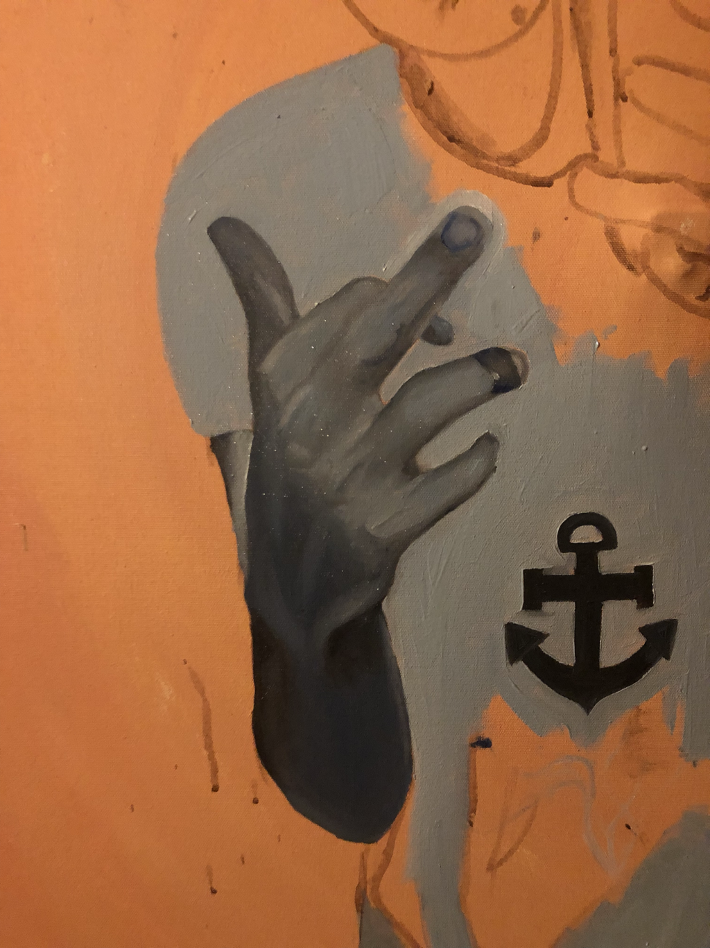
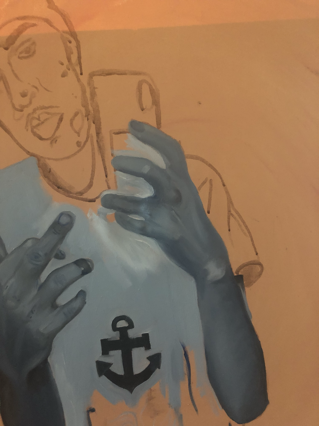
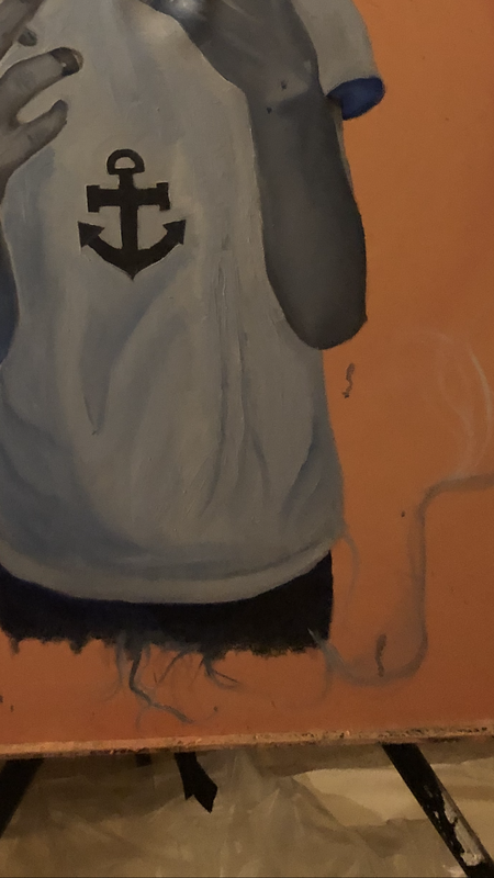
Once I had gessoed my canvas, I began to paint the portrait of the person for my summer project. To begin the process, I started by projecting the image of the person in the middle of my canvas, so that I could make the person the main focal point of the painting. How I projected the image was pretty fast and quick, I mixed brown acrylic paint with a good amount of water to create a wash that would be used to help to trace the main outlines of the image of the person projected. Once I traced out the outline of the person onto the canvas, I, then, began to paint the the hands of the person first.The only colors I chose to use to paint the figure was blue, white and black oil paint. So, as stated before I began by painting the hands of the figure, to begin I mixed the colors black and blue to create the shadows of the forearm and the hand. I did the basic structure of the arm by painting the shadows and highlights without blending it so I could see where everything in this painting would be placed. However in the beginning (as seen in the pictures shown above) when I began painting the arm, the colors appeared to be very bright and not as muted as I had wanted it to be. So I added white to the mixture of blue and black oil paint and that created the color I had wanted. With the hands specifically, I like I had said, painted the shadows of the hand first and then moved onto the highlights, later blending them together. (This process was done throughout the whole piece. ) Once I hand blended all the colors together, I began to move onto the detail of the hand, creating the folds of skin within the fingers, the highlights of the nails and where the light hits the fingers/hands, etc. I repeated this entire process for the other hand as well, however, I included the phone as well into this part of my process since the phone was directly lying underneath the image of the hand. To do the phone, I painted it one single color, which was a dark blue and used white to create the the reflection of the finger on the phone case.
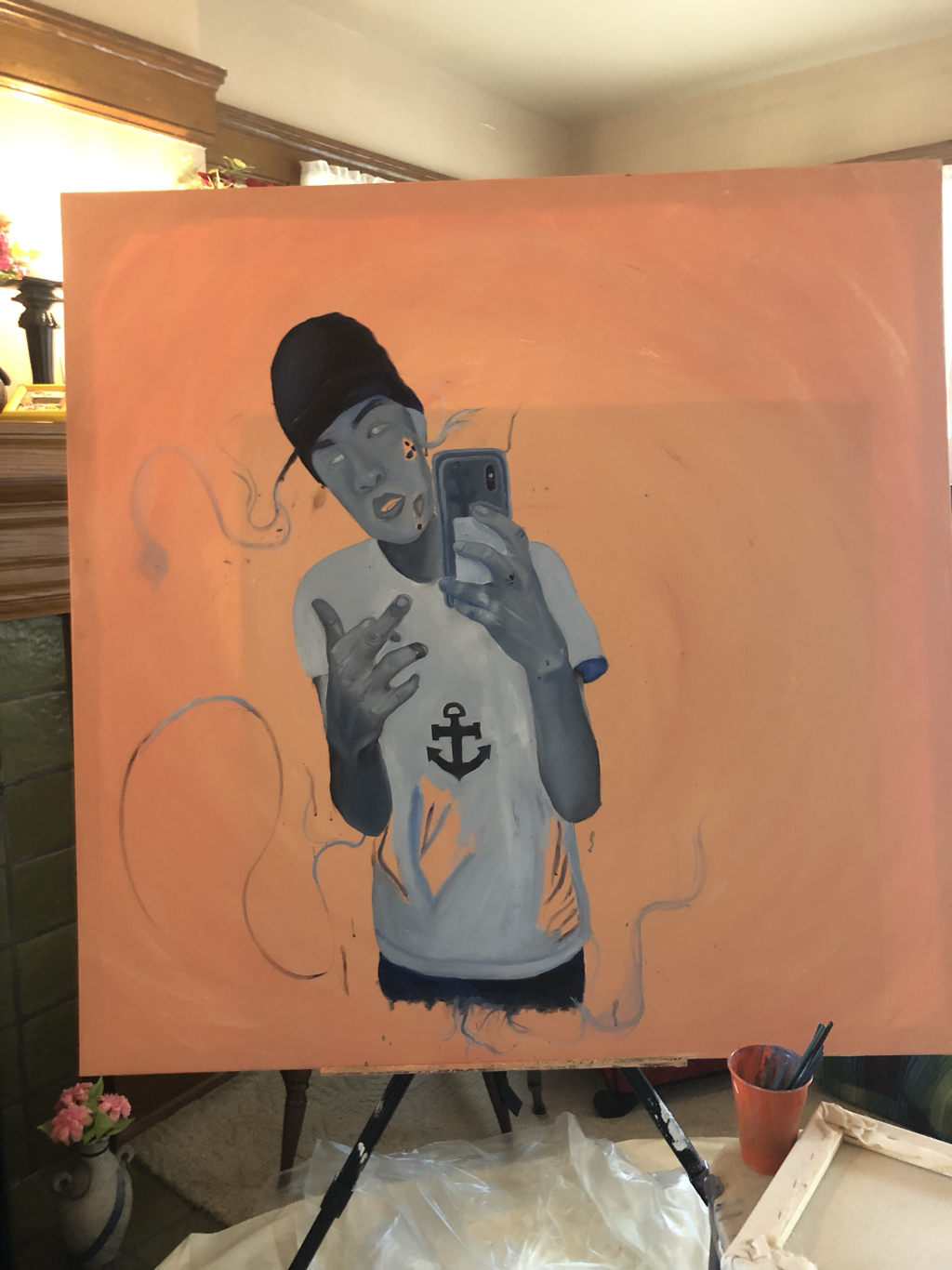
The next thing I did was move onto the shirt and face. For the shirt, I only used white and blue to create the color of the shirt and the folds of the shirt.
The next thing I did was move onto the shirt and face. For the shirt, I only used white and blue to create the color of the shirt and the folds of the shirt.
EXPERMENTATION
|
|
|
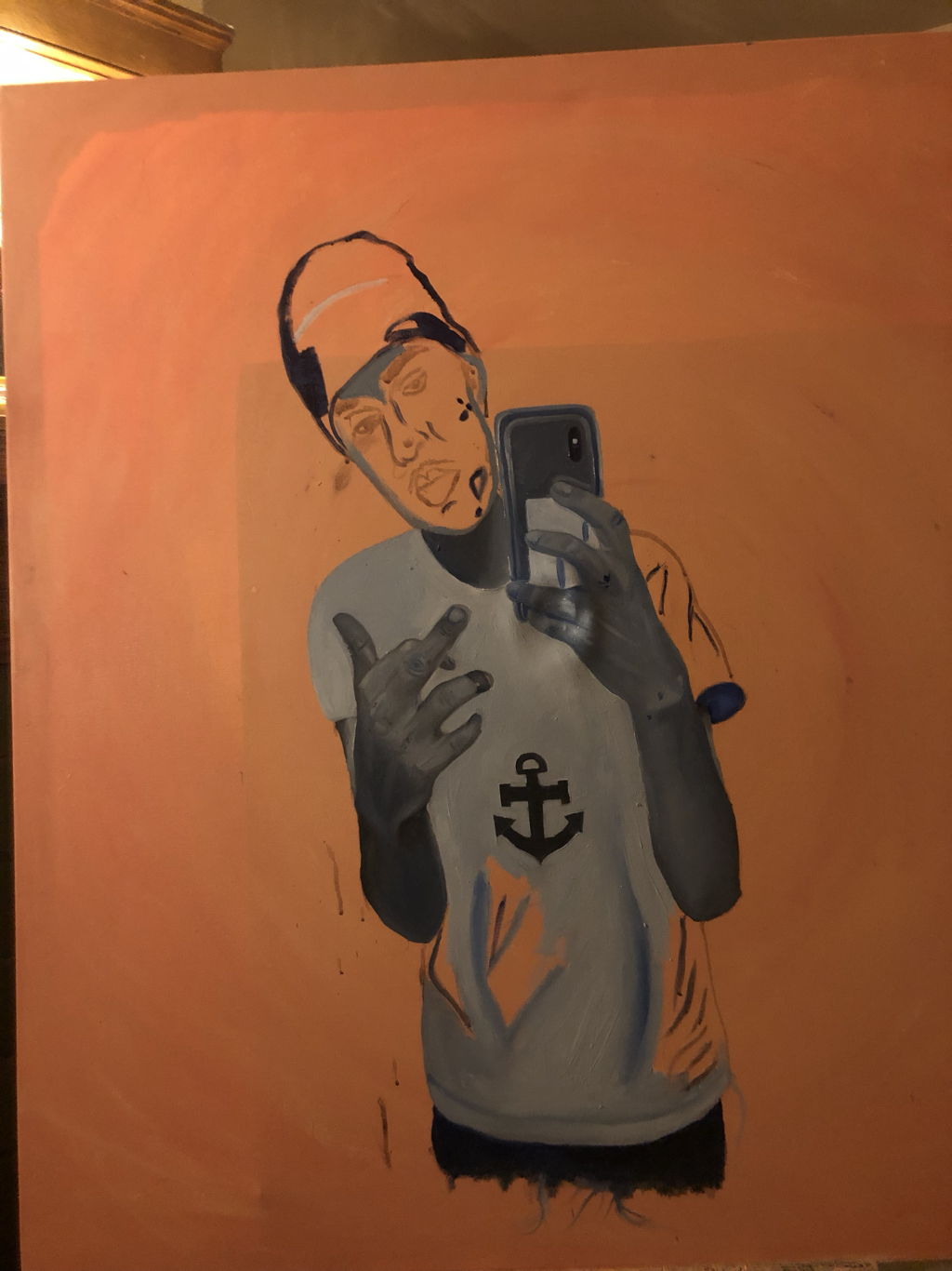
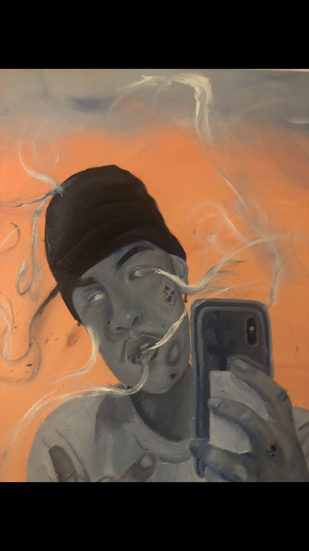
With this painting, there were many things that I found difficult to do. Once I had finished the majority of the painting, I then wanted to move onto painting the smoke emerging from the body and this was wear I had to experiment with my painting techniques. When I was painting the face, specifically the eyes, and cheeks of the face. The face was where I began to experiment how I wanted the smoke to look like and what colors I wanted to use. For example, with the eyes, mouth and cheeks of the figure, I used white oil paint to create the smoke but when doing this I realized I couldn't just use white because it washed out the rest of the figure's body. Instead, I used some blue and black to create depth with the smoke. The reason why I used blue and black within the smoke was to have it create more a monochromatic color.
